In today's lesson I researched into radio ad campaign's but I couldn't find any Radio adverts for Newspapers so I decided to look at them in General. I listened to 4 Radio Adverts and I will now look at what makes them appealing to their target audience.
The first Advert within the video is an advert for a Volvo Car. This advert is very serious as it is only a man speaking in a very serious tone of voice. This to me suggests that it is aimed at people with well paid jobs like a business man who has a family at home.
The second advert is for Kwik Fit. This advert is totally different to the Volvo advert as it is more of a conversation between a man and a woman which suggests the target is more general compared to the Volvo advert. I think the main reason why this advert is more generally targeted is because it is trying to promote a offer that they are doing rather than a specific product.
The third advert I will look at is HSS Hire. This advert is more for the people who are tradesman as the advert gives a list of jobs that they would do like maintaining, lifting, etc. This advert also seems quite serious to me as it only has one person talking and no sound effects but the person who's reading the script sounds a bit more up beat in his tone of voice which could represent a different target audience compared to the Volvo advert.
The final advert I will analyse is for a Company called Aer Lingus. This advert is like the Volvo and HSS Hire advert, whereby there is only one person in the advert speaking, but the main difference in this advert compared to the Volvo one is that there is up beat music in the background, which to me suggests that they are trying to grab everyones attention as they are promoting a sale.
One thing I did notice at the end of each of the advert they would either have there company slogan read out or details about the business like website, telephone number, etc.
Monday, 6 December 2010

Monday, 29 November 2010
Research/Planning into Newspaper poster's.
In today's lesson I looked for advertising poster's made by newspaper's to promote their companies. I found a lot of posters from the national newspaper "The Guardian", "The Metro" and "The Sun", and will now research them and what they are trying to tell the audience.
 This is the first poster I found from the Guardian. It it very simple. I like the way the designers have a lot of computer mouses with a line leading to the centre of the page, and I think that they are trying to get the audience to think everyone's opinion is equal and they won't try and tell them any biased stories and is letting them make up their own mind.

 This poster is very simple, as it has no price, no description on what is included or if they are trying to force you into believing their opinions.
 This is the second Sun poster I have seen. It has a lot more going on unlike the other sun poster. The slogan at the bottom says: "Big Opinions. Every Day", which I think is telling people that they are trying to force their opinion on to you whereas the Guardian let you decide what you want to believe.
For my Poster Campaign, I'am thinking of doing something a bit different from the poster's I analysed earlier. What I plan on doing is taking a photo of a brick wall and putting some of the things that are included within my newspaper in a graffiti style font. I like this idea as it has some of the things that people in my age range would do in their spare time, and that's what I think could make it appealing to my target audience.
One thing I will do that happens with the other poster's is the inclusion of their logo and a slogan. I have also decided to do this as it is for brand identity and your newspaper would be easily recognisable by doing this.
 This is the first poster I found from the Guardian. It it very simple. I like the way the designers have a lot of computer mouses with a line leading to the centre of the page, and I think that they are trying to get the audience to think everyone's opinion is equal and they won't try and tell them any biased stories and is letting them make up their own mind.
 They follow this idea up with a few lines of text saying:
"Listening to lots of different views, rather than just one, mean's you can decide for yourself, instead of being told what to think. Don't you agree? You don't have to of course". The designers have kept the text to this poster very simple but also tells the audience that it is interested in telling them honest stories and doesn't pressurise them into believing what they want them to.

This next poster I found was not actually advertising what the belife of the newspaper is about but instead about the content that is coming in the newspaper, in this case, a WWII pullout. They have put a lot of thought into this poster as it is advertising a WWII poster, they have give it like a tea stained background as it is old. The four arrows they have on the page cover four different aspects of the war and also join up in the middle of the page to reveal the Swastika.
Yet again the designers of this poster have kept it simple, by not going into great depths at what the pull out will actually include but they have got some symbolic things from WWII, which when people glance at it they will know immediatly what the poster is trying to tell them.
I will now look at a couple of poster's from "The Sun" newspaper. This is the first poster I found from the Sun.
 This poster is very simple, as it has no price, no description on what is included or if they are trying to force you into believing their opinions.
 I think this poster has been made the way it has as they are trying to get everyone interested in reading it as some people might like an unbiased view on news.
 This is the second Sun poster I have seen. It has a lot more going on unlike the other sun poster. The slogan at the bottom says: "Big Opinions. Every Day", which I think is telling people that they are trying to force their opinion on to you whereas the Guardian let you decide what you want to believe.
For my Poster Campaign, I'am thinking of doing something a bit different from the poster's I analysed earlier. What I plan on doing is taking a photo of a brick wall and putting some of the things that are included within my newspaper in a graffiti style font. I like this idea as it has some of the things that people in my age range would do in their spare time, and that's what I think could make it appealing to my target audience.
One thing I will do that happens with the other poster's is the inclusion of their logo and a slogan. I have also decided to do this as it is for brand identity and your newspaper would be easily recognisable by doing this.
Final Product Design
This is my final newspaper layout for my newspaper. Iam happy with how my newspaper developed over the weeks since I started and it started to look more like a professional newspaper each week when I started to add new content to it.


Monday, 15 November 2010
Newspaper Construction
Over the past few weeks I have been concentrating on the construction of my newspaper. I have nearly completed my newspaper and I only need to take one more photograph. Once I have completed the construction of my newspaper I will research into newspaper advertising posters and newspaper radio adverts.
When I came up with a number of mock layouts for my newspaper I planned on sticking to the one that I thought was most appealing and using the feedback from my target audience. During the construction I decided to change a few things by moving stuff around certain pages but overall I'am happy with the way my newspaper is starting to look.


Thursday, 21 October 2010
Mock Layouts
Over the last couple of days I have added stuff to my layouts. I have uploaded images of what I have added. I did not take those pictures I just added them to my layout to see what they look like. The first two images are of my front page designs.

I have added some images and colour to my second pages aswell. Below are the layout for them.


I have added some images and colour to my second pages aswell. Below are the layout for them.


Tuesday, 12 October 2010
Research & Planning
I started of the research and planning section by carrying out some secondary research. The analysis of Liverpool Echo was key as I think that the amount of research I did into the layout and conventions of the newspaper I gained enough information and knowledge into what makes a succesful newspaper. The analysis of the other two newspapers I analysed The Metro and The Challenge we're also a benifit to my secondary research as they had different target audiences compared to the Liverpool Echo. Overall, I think the whole of my secondary research was a success as I did not have have knowledge into codes and conventions of a succesful newspaper before I started this task.
I also carried out primary research which included creating and distributing two questionnaires, and emailing a local newspaper. Before I started work on my questionnaires I emailed the Liverpool Echo with a few questions that would be benifical to my research but unfortunatley I never recived an email back from them but I think that the amount of research I done besides this was enough for me to plan my newspaper anyway. I created two questionnaies, one for people who read newspapers and one for people that don't read them. All of the questionnaires were distributed to people within my targeted age range so I ask them certain questions like what the like to read in newspapers and how much they would be willing to pay for newspapers, etc. When I collected all my results I created graphs for every question so that I could see all of the results very easily and notice certain trends in the results.
Planning of my newspaper was the final part of the research and planning section of my newspaper production. I started this after I finished all the research I thought was nessecary. The main part of planning the focus group as I got feedback on all the layout and fonts that I thought would be suitable for my newspaper. The focus group was a key part as the other people within the group said what they liked and disliked about certain things about fonts and layouts and how I could make it better. I have now completed all the research & analysis for my newspaper. This has been key for me as it has informed me of what my target audience want from my newspaper. If I just ignore this feedback and just start creating a newspaper I know that wouldn't read this newspaper as it doesn't appeal to them.
I also carried out primary research which included creating and distributing two questionnaires, and emailing a local newspaper. Before I started work on my questionnaires I emailed the Liverpool Echo with a few questions that would be benifical to my research but unfortunatley I never recived an email back from them but I think that the amount of research I done besides this was enough for me to plan my newspaper anyway. I created two questionnaies, one for people who read newspapers and one for people that don't read them. All of the questionnaires were distributed to people within my targeted age range so I ask them certain questions like what the like to read in newspapers and how much they would be willing to pay for newspapers, etc. When I collected all my results I created graphs for every question so that I could see all of the results very easily and notice certain trends in the results.
Planning of my newspaper was the final part of the research and planning section of my newspaper production. I started this after I finished all the research I thought was nessecary. The main part of planning the focus group as I got feedback on all the layout and fonts that I thought would be suitable for my newspaper. The focus group was a key part as the other people within the group said what they liked and disliked about certain things about fonts and layouts and how I could make it better. I have now completed all the research & analysis for my newspaper. This has been key for me as it has informed me of what my target audience want from my newspaper. If I just ignore this feedback and just start creating a newspaper I know that wouldn't read this newspaper as it doesn't appeal to them.
Monday, 11 October 2010
Focus Group
In todays lesson, me and three other people got together as a group and looked at eachothers page layouts and fonts. For this I created three front cover layouts for my newspaper and three inside pages for my newspaper. I also gathered some fonts together for people to decide what would be the best one for my newspaper.


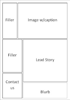


These are the three front cover layouts I created for my newspaper and the most popular choice with people in my focus group was the final layout which got two votes and the first layout getting one vote. The feedback for my most popular was that it would be ideal if I could move the blurb on the left just above the advertisment above the main lead.
I will now upload my three inside pages.


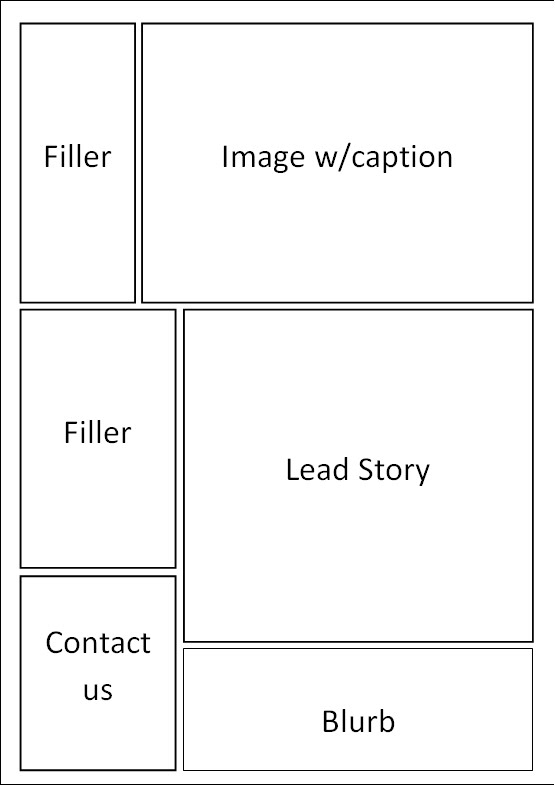
These are the three inside pages for my newspaper. The most popular choice with people in my focus group was the first layout I drew. I had no feedback for these layouts as the people said that they wouldn't change anything about the layout the chosen. I will now upload the fonts that I think would be most suitable for my newspaper.

Above is the list of fonts that I think I could use for my newspaper. The most popular font on those that I chose was the New Athletic font which is third on the list of those fonts. The feedback that I was given on the chosen font was that it looked a modern but at the same time professional font.
Subscribe to:
Posts (Atom)