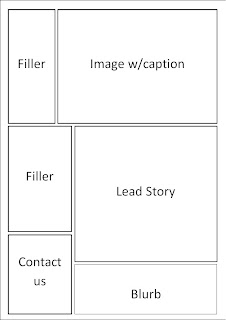
These are the three front cover layouts I created for my newspaper and the most popular choice with people in my focus group was the final layout which got two votes and the first layout getting one vote. The feedback for my most popular was that it would be ideal if I could move the blurb on the left just above the advertisment above the main lead.
I will now upload my three inside pages.
These are the three inside pages for my newspaper. The most popular choice with people in my focus group was the first layout I drew. I had no feedback for these layouts as the people said that they wouldn't change anything about the layout the chosen. I will now upload the fonts that I think would be most suitable for my newspaper.
Above is the list of fonts that I think I could use for my newspaper. The most popular font on those that I chose was the New Athletic font which is third on the list of those fonts. The feedback that I was given on the chosen font was that it looked a modern but at the same time professional font.


No comments:
Post a Comment